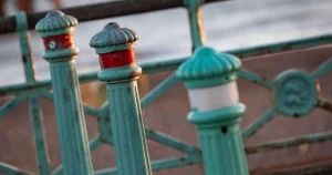


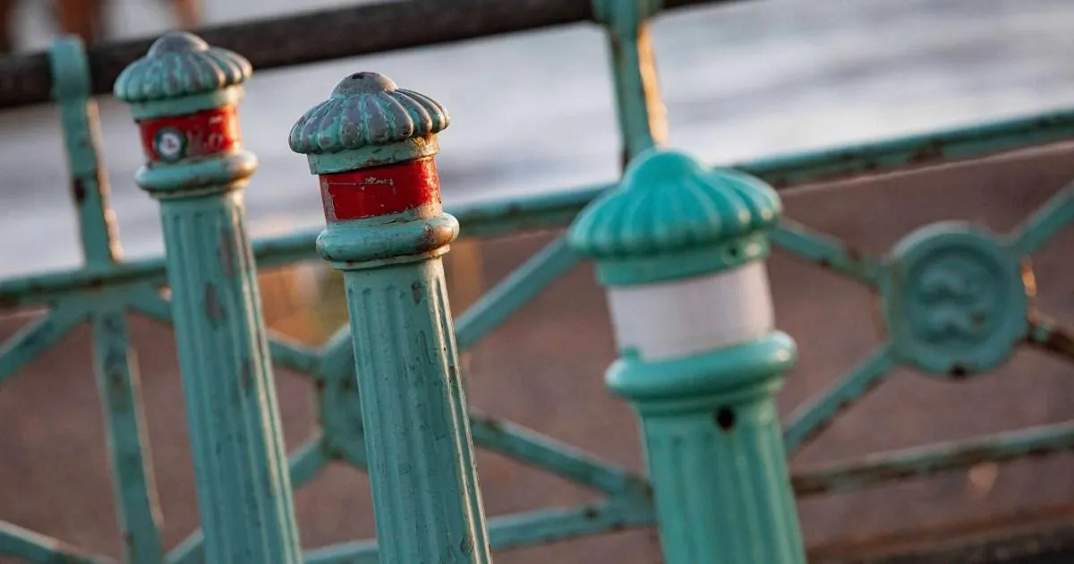
There is a colour that has, for more than a century, been as much a part of Brighton as the pebbled beach, the cry of gulls and the rattle of the pier. Known simply as Brighton Blue, this soft, sea-washed aqua has been painted across the seafront railings, lamp columns and cast-iron bollards for over a hundred years, a quiet but constant companion to the daily tides. Visitors may not have known what to call it, but they felt it: the pale turquoise shimmer that framed the promenade, catching the afternoon sun, softening the salt winds, and making the city feel unlike anywhere else. So when Brighton & Hove City Council announced that it would be giving up the colour because it had become too expensive, the news landed with unexpected emotional force. The problem, council officials explained, was not love for Brighton Blue but the price of reproducing it. A bespoke shade can cost thousands of pounds to manufacture, so the council has chosen to switch to a similar standard industrial colour known as RAL light green, the closest match it can find to the pale turquoise of old. RAL might sound like a technical code for a paint tin, but the change is being presented partly as maintenance strategy and partly as heritage protection. For many people in the city, though, the adoption of a generic shade feels like a step away from the town’s quirky, lovable identity. It is hard to put your finger on why a decision about paint could stir so much feeling, but Brighton has always had a strange, emotional relationship with its own image, and this aqua was never just a colour. It was a memory, a postcard, a mood, and now it is being quietly retired to the past.
Brighton Blue did not emerge from nowhere. Its roots lie in the city’s Victorian seafront, where cast-iron railings, lamp standards and the famous Madeira Terrace arches were built to impress the promenading crowds. For decades, these structures were painted in shades of turquoise that weathered beautifully in the salty sea air. The exact formulation changed over time, but the visual effect remained part of the local landscape, a unifying ribbon of colour running along the water’s edge. Microscopic paint analysis has now shown that the turquoise used on the Madeira Terrace, the listed seafront arches currently being restored, goes back to the 1920s. That discovery made the colour feel even more precious. It was not a designer’s fantasy or a modern branding exercise; it was a genuine piece of seaside history, layered into the ironwork year after year, decade after decade. Generations of children leaned against those railings while eating ice cream. Generations of lovers posed in front of those lampposts. Generations of residents used the colour as a way of explaining where they came from. There is a particular kind of nostalgia attached to a waterfront, and part of that nostalgia is the colour itself. Yet by the time the council finally acted, the familiar railings were in trouble. The old paint was chipping, flaking and rusting, and the cast iron beneath needed serious help. The city faced a choice: keep the exact historical colour and let the structures decay, or find a tougher, more modern coating that could protect the ironwork for future generations. The council chose the second option, and with it, a different shade. RAL light green may sound like the name of a municipal product, but in daylight it is intended to be very close to the old turquoise. Still, for those who had grown up with Brighton Blue, the change has an air of loss that no colour chart can explain.
The decision has split local opinion in a way only heritage-and-money stories can. On one side are those who see the switch as an act of cultural vandalism. “More of Brighton and Hove’s heritage being sacrificed by this council,” one Facebook user wrote. Another insisted: “The colour is too modern for Victorian railing and lampposts. Typical Brighton Council.” The word “modern” is interesting, because RAL light green might look almost identical to an untrained eye, but the idea of it, the sense of a generic industrial tone replacing a beloved custom colour, is enough to make people wince. The suggestion is that the council is cutting corners, quietly erasing the past in small steps until one day the character of the city is barely there. For these critics, the decision is not simply about paint; it is about a pattern of neglect and compromise that chips away at what makes Brighton special. But there is another side, equally passionate. Some residents have pointed out that the old railings were hardly in their glory days. “It’ll look a damn sight better than the flaky railings and posts now,” one local said. That practical voice is easy to overlook but hard to argue with. A seafront can be romantic in many ways, but peeling paint and orange rust are not the sort of beauty most people want to celebrate. For these residents, a well-maintained railing in a slightly different shade is better than a beloved colour crumbling into the sea. The issue is, of course, that both sides are right. Heritage matters, but so does the physical survival of the structures. The arguments taking place in Brighton are the same arguments taking place in seaside towns all over Britain, where councils are trying to balance the poetry of the past with the hard economics of upkeep. There is no perfect way to choose between memory and money, and no decision could have made everyone happy.
The council insists that the decision has been made with real care. Councillor Jacob Allen, cabinet member for public realm, has framed the move as part of a wider restoration programme rather than a retreat from heritage. “As we continue to restore our historic lamp columns, bollards, railings and, of course, the Madeira Terrace arches, serious care and attention is given to the heritage,” Allen said. “Our approach balances preserving these iconic cast iron structures with taking advantage of modern preparation methods and advanced protective coating systems to ensure they can be maintained in the future.” He explained that the new finish is not simply standard paint but a specialist, cost-effective and long-lasting coating system. The closest available match to the turquoise used on the terrace since the 1920s was chosen, using microscopic paint analysis to determine what that shade actually was. This technical detail matters. It means the process was not arbitrary; it involved science, history and patience. But it also highlights how far decisions about public heritage have come. The days of slapping on a coat of whatever was in stock are over. Today, councils have to think about maintenance cycles, protective systems, environmental standards and budgets, all at once. Allen also pushed back against the suggestion that the only motivation was saving money. “While we welcome the savings this new technique will bring, our primary aim is not short-term cost reduction but the application of restoration techniques that better preserve and protect our historic infrastructure,” he said. “The coatings will keep the cast iron in good condition for longer, extend maintenance cycles and reduce the frequency of future interventions. This is a more sustainable approach to maintenance and may generate savings over the longer term.” That might sound like carefully chosen official language, but it also makes sense. If the railings survive longer, they remain heritage. If the exact colour fades faster, the structure might not survive at all. For a city full of historic cast iron, protecting the metal may be the best way to protect the memory, even if it means sacrificing a few shades of turquoise.
Those questions are not abstract. In July, a report set out the financial outlook for Brighton & Hove City Council: a projected overspend risk of £19.882 million in 2026/27, driven largely by rising demand and complexity in social care services. Like many local authorities, the council is being squeezed from all sides, facing greater need for care, higher costs, and no end in sight. In that context, every decision about paint is a decision about priorities. The exact financial saving from using RAL light green rather than a bespoke Brighton Blue has not been fully disclosed, but the point is clear: no council can ignore cost indefinitely. Even a few thousand pounds saved by choosing a standard shade is money that can be spent elsewhere. It is easy to look at this and sigh, to feel that the colour is being sacrificed for a spreadsheet. But it is also true that the same budget pressures are threatening far more than paint. Social care, housing, street maintenance, parks, libraries: all are under strain. A city cannot pour every available penny into the exact turquoise of a Victorian railing while care homes and hospitals cry out. That is not to say the heritage should be dismissed. It is simply to explain, with a heavy heart, why councils across the country are making similar decisions. The seaside towns of England are full of beautiful old things that are expensive to maintain. The people who manage the public purse have to weigh the value of a shade of paint against the value of human services. In an ideal world, Brighton would have enough money to preserve every historic detail and support every vulnerable resident. In the real world, it has to choose, and those choices are rarely as simple as they look from the outside.
So what happens now? On the seafront, the old paint will continue to be stripped away, the rust treated, and the new protective coating applied in its place. In daylight, the council says, it will look very close to the turquoise of the 1920s, so much so that most passers-by may not notice the difference. At night, the new lighting scheme on the Madeira Terrace will create different visual effects, casting the restored arches in fresh and unexpected ways. Over time, the colours will become more muted, but the protective benefits will last. For the people who love Brighton, the hope is that the railings will still be there for another century, even if the exact colour is a little different. But the feeling of Brighton Blue will not vanish completely. It lives on in photographs, in postcards, in the memories of anyone who ever stood against those railings and watched the sun sink into the sea. It lives on in the stories people tell about why they came to Brighton and never left. RAL light green may be the mechanical replacement, but the emotional original belongs to no colour system. Perhaps, eventually, a new generation will grow up with the new shade and love it just as much. Perhaps they will not call it RAL anything; they will simply call it the colour of the seafront. In the end, the crisis that forced this change is not going away, and councils will keep having to make unenviable choices between preservation and practicality. But Brighton, where the sea and the sky are changing shades all the time, still has a stubborn sense of place. The paint can fade, the rails can rust, the budgets can shrink, and still the city remains. What makes a seaside town special is not any single colour. It is the way a place makes people feel. And that, thankfully, cannot be measured, costed, or reduced to a standard shade. It simply has to be lived, remembered, and carried forward. Brighton Blue is gone. Brighton is not.